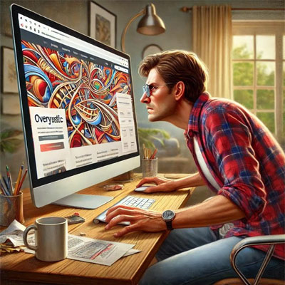
Designing a website—whether it’s a total overhaul or a fresh build—is exciting. Everyone wants the digital equivalent of a sleek, sexy billboard. But here’s the thing: “cool” doesn’t convert. While flashy animations and trendy designs might make your team say, “Wow,” they’re not what keeps people on your site or gets them to click your call-to-action.
Let me be blunt: websites are not art. They’re tools. And the tool’s job? To meet the user’s needs as fast and friction-free as possible. That means prioritizing functionality, usability, and accessibility over some designer’s obsession with background videos or parallax scrolling. Sure, those look great—until they bury your CTA or slow your load time.
Think about it: you’ve got less than 10 seconds to convince someone to stay on your site. Most people will make their decision in three. Three seconds. If your site doesn’t communicate what you offer—and why they should care—faster than a toddler losing interest in vegetables, you’ve already lost.
Here’s how to get it right:
- Start with the User – Forget what you want. What does the user need? Build from there.
- Navigation is King – If it takes more than two clicks to find the most important stuff, you’ve failed.
- Mobile First – Your site needs to look sharp and function perfectly on a phone because that’s where most of your traffic is.
- Accessibility is Not Optional – Want to alienate a chunk of your audience? Ignore accessibility. Want to win? Build for everyone.
- Data > Gut Feelings – Test, iterate, optimize. Your instincts aren’t as sharp as your analytics.
You can still have a visually stunning website—no one’s saying you can’t—but the goal isn’t “cool.” The goal is effective. A great website isn’t just a nice outfit; it’s a machine that works for your business. Treat it that way.
Need help with your next website design? Let's talk.
"*" indicates required fields

